Friday, November 21, 2014

ART - AUTHOR: Clare Pernice

CLARE PERNICE is a children's Book author/illustrator and we share a passion for children's books. Clare's book, Circus Girl (published by Simply Read Books) just out this year is a must have for little one's who dream big.

DM: What made you choose to pursue children's books?

CP: My childhood memories and reading to my children have inspired me to create picture books. I love books with unique characters and expressive words. I collect picture books of every shape, size and genre. 

DM: What were your favorite books growing up?
CP: There are three that come to mind. Firstly, Babar, it was my father’s tattered copy from his childhood which he read it to me when I was very, very young. Many of the B&W spot illustrations inside were colored in by him when he was little and then more coloring was added by me, we both had an exuberant scribbly style. I loved this story of the little orphan elephant who was taken in by the rich, old lady. When she took him to be fitted for clothes it was so enchanting because he anthropomorphically transforms and he has all sorts of adventures thereafter.
The Necklace of Raindrops was a book that I discovered by myself at the library, I was about 7. I just loved the stories and especially the Necklace of Raindrops. I dreamed of having such a necklace. The illustrations were also intriguing. Alice in Wonderland is the classic that I’ve never grown tired of. Others worthy of a mention would be Wind in the Willows and Pooh Bear stories as well as Everything written by Enid Blyton.


DM: What was your inspiration for Circus Girl?
CP: Circus Girl was especially inspired by my daughter’s love of dressing up and performing. 
   
DM: Which comes first, the words or the images?
CP: I think that both come together. First the idea germinates, I write it down and begin doodling characters. Then I write some words and more images spring to mind, back and forth. It is definitely a partnership of words and pictures.


DM: What is your favorite medium?
CP: I love colored pencils and watercolor paints, pans, tubes and inks. My favorite brands are from Japan and Germany and England. 

DM: Do you use a computer?
CP: I do like my Macbook and I know I could do a lot more on it besides emailing, researching and exercising a couple of fingers but I haven’t found time yet to learn all the amazing design programs available. One day I’d like to but I derive too much pleasure from art materials!

DM: Did your work in film have any influence on your picture books?
CP: Yes, I think that working on a film from it’s original concept through research, production design, directing, editing and the final result have a parallel pace to making a picture book. My enjoyment and satisfaction comes from being involved in the book’s creation from start to finish. 

DM: What are you working on next?
CP: Currently I’m finishing up artwork for my Mother Goose book which will be published next year and I’m working on Adventure Boy, the companion book to Circus Girl.   

DM: What else would you like people to know about you or your work?
CP: Our dog Milo is famous in Weston, he is the mascot for my son Oliver's sports teams. My daughter Mia is musically gifted and is at a school for the arts. Circus Girl was published by Simply Read Books this year and it has been a wonderful experience to do book signings and read my book to children.  I am thrilled to have the opportunity to converse with Donna about being a picture book author and illustrator. Thank you for interviewing me. 

ABOUT CIRCUS GIRL:
When a little girl plays dress up in her leotard and socks she becomes Circus Girl star of the show. read more HERE.
You can learn more about Clare by visiting her web site at www.clarepernice.com

If you're in the Charleston, SC area she will be signing books at Blue Bicycle Books Dec. 6th.

Clare will be speaking on the artist panel Saturday, February 7th in an interview with the artists for the exhibit Dickens: A Celebration In Pictures. Both our work is included in a selection of work from the bicentennial celebration exhibit of Charles Dickens' classic books on view at the Poe Visitor Center February 3 through 21, 2015. Bring your kids and enjoy a Dickens Character Paper Puppet workshop with us too, see schedule for date info. For schedule information CLICK HERE

Tuesday, May 27, 2014

Theater - Robert Greer

Robert Greer is Artistic Director of the August Strindberg Repertory Theatre in New York. He and I met many moons ago at a NYC Ballet production. We were standing next to each other in the standing room only tickets section. Happily, today we sit! 

DM: When did you start directing? 
RG: I studied directing at Emerson College in Boston and began directing Equity casts while still in grad school at CUNY and Columbia, where I kept directing professional casts after finishing my Swedish studies in the early 90s. I’ve belonged to the Stage Directors and Choregraphers Society since 1998. 

DM: What is your approach to directing your actors? 
RG: I was taught that the first three rules of directing are: 
               choose the right play 
               choose the right cast 
               stay out of their way
        To which I would add one more between rules ii and iii - choose the right ground plan

DM: What drew you to Strindberg? 
RG: I bought a paperback collection of his one-act plays less than a week after graduating college and was so struck by his often brutal honesty that I read them all in one sitting. 

DM: What do you think people should know about Strindberg and his work? 
RG: Strindberg is simply the most important writer since Shakespeare and not merely for his plays. He would be still more famous as a novelist had he never written any drama, a fact that is not true of any of his more famous contemporaries.

DM: Strindberg’s work was written in the 19th century Sweden and takes place in that era as well. Your production of Playing with Fire was set in 1920s Martha’s Vineyard in an affluent African American community and played with an all African-American cast. Talk about why you decided to go in that direction. 
RG: The class structure of XIX-century Sweden is even more remote to Americans than the British, to which they’ve had some exposure by way of the BBC’s excellent programming. A direct parallel in American society is the division between the races. I try to make one adjustment, however major, to a script and allow every other choice follow as a consequence of that one change.

DM: Are you hoping to engage a new audience of theater goers by having some Strindberg productions set in more contemporary times and using casts that reflect the diversity of cultures here in New York? 
RG: Absolutely! There is no reason to set productions of his plays in a foreign land – Sweden – nor necessarily in the time at which they were written. When they were originally performed the action took place in the present. That doesn’t mean they have to be played in the New York of 2014, rather that thought must be given to the when and where. 

DM: I’d like to touch on another interest of yours. How does ballet figure into your life?
RG: Until the Strindberg Rep began taking all my waking hours, I wrote about New York City Ballet – and some other – on Wikipedia. I’d been keeping programs and my personal notations and decided to keep them in public instead of in private. Very few people write about ballet on Wikipedia and City Ballet has an enormous repertory, so there was a lot to do. 
Donna Miskend
DM: You used the Pink Pig Ballet company in your production of Strindberg’s Casper’s Fat Tuesday. What was the thinking behind this and is this a direction you’d like to explore again? 
RG: Casper is a puppet play written to be performed by living actors. The connection between dance and mime and puppetry spans cultures and centuries. In European culture, the tie between ballet and mime is particularly tight, so using ballet dancers to play the puppets was a small step.


Donna Miskend 2014
DM: To Damascus will be performed in 3 parts, beginning with To Damascus Part One this season. Why are you telling it in 3 parts?
RG: To Damascus is a trilogy which has not been performed complete in 99 years and never done without major cuts in English. Each part is a full-length play and deserves to be rehearsed and presented as such, not turned into a club-sandwich. 

DM: What is your next production? 
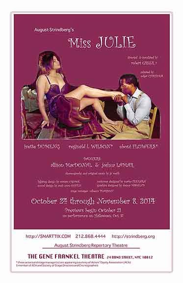
RG: Miss Julie, set in Louisiana in the year it was written, with a mixed-race cast. We will have ballet dancers again as the farmhands who drunkenly storm the mansion’s kitchen, something Strindberg wrote in the original manuscript and which has never been done. 
design, Donna Miskend 2014


DM: What else would you like audiences to know about your production? 
RG: With the sole exception of Miss Julie, it is our intent to perform the plays of Strindberg that have not been done – or done recently – in English. Some – Casper’s Fat Tuesday and Mr. Bengt’s Wife – have never before been translated.

DM: As Artistic Director of the company, what is your vision for the future for The August Strindberg Repertory Theatre? 
RG: Strindberg wrote sixty plays, almost all of which would be of interest to an American audience if brought into its context. We should choose the major works and those unjustly neglected first and see how far we get. 

Visit their web site for a schedule of performances at www.strindberg.org

Sunday, June 30, 2013

ART- ARVIND GARG PART II

Arvind Garg is a photographer living in New York. This is part II of a two part interview. Do read Part I first - CLICK HERE
all images Arvind Garg and may not be reproduced without permission.
DM: You have chosen to go the self published route with your photography books. Why?
AG: There have always been photographers and other visual artists who had to self-publish their books, for it is almost impossible for anyone without a celebrity name to find a commercial publisher who will risk money on a book by a relatively unknown artist.  But to publish a book yourself you needed lots of money, and then there was the problem of distribution.
I never thought of self-publishing books of my work until the digital revolution came out with the technology that made it possible to do it without spending much money. My friend Dennis who did a few books and was thrilled by the experience encouraged me to do the same. I did my first in 2008, a small format (7x7) book of my black and white images taken in Japan in 2002. Since then I have published fifteen books in different formats and sizes and on subjects ranging from focus on places (Egypt, India, Tunisia, Syria and Jordan, New York, Turkey) to fine art images (The Eucalyptus Way, Gallery Light), to memoir and biography (Marina) and portraits (Facing the Creator). 

DM: Your book on Marina is a lovely tribute to your wife who died of cancer. It is a celebration of her life with you, her craft as a writer with the inclusion of pages of her manuscripts with handwritten notes on them, and an indication of her struggle with her illness. It's a very personal book. Would you say that this is an example of a project that you thought might not be embraced by traditional publishing, but one that as an artist yourself you had to share? Or do you simply prefer the creative freedom of self publishing?
AG: I met Marina in 1986 in New York and we started living together right away. Officially we married in 1994, just four years before she passed away. She was a person of incredible personal beauty and moral integrity and she had a vision of an active and meaningful life as a poet and an arts enthusiast. Despite her uncertain health throughout our life together, she was unstoppable in doing things she wanted to do, for realizing one’s potential to her was a moral obligation.
Her pre-mature death left me not only with folders and boxes full of her writings and journals, but with an experience and indelible memory of having shared part of my life with a woman of extraordinary beauty and depth and passion. For more than a decade I knew no way to mourn her or to memorialize her and her life the way I wanted to. I did not have  funds to create an arts organization in her name or to sponsor a poetry scholarship named after her or to fund a corner of Central Park’s Observatory Garden that was one of her favorite spots in the city, or any of the other ideas that would preserve her name and  be her legacy. 
I always knew I would do a book on her. I had photographed her from the first day we met and until the end. She was my wife and companion but she, with her irrepressible nature and changing moods, was also a mystery to me. She was always searching for something, mostly looking for ways to give expression to her own inner nature and vision, for there was no peace  for her without it.
Finally doing a book on her became my way to mourn her. Once I started working on it, it took me six months to finish, because it was like re-living our whole life together. I read every piece of her writings and kept finding more and more of her photographs in my files and folders and boxes. The layers of memory became deeper and deeper with each new find, helping me to feel her presence in my life once again.

I never even considered that a commercial publisher might do the Marina book. It is a very personal thing, and had to be done by myself in every detail. In a way it made itself,  as it grew and flowered organically watered by Marina’s own words. The photographs are mere foundation for the project. I also think of the book as a fountain, like the Arethusa, which was the name Marina gave to the organization about Italian art, history and life that she founded.

DM: You were in Syria a month before the war broke out. What are your thoughts about what you experienced and the situation today from the perspective of having just done a photographic essay there?
AG: Yes, I traveled in Jordan and Syria just before the fight against Assad's regime took off. It took me by surprise as much as it did the rest of the world, for as a tourist I detected no sign of any looming political or social unrest. In fact I felt that the country and its people were remarkably civil and polite, and there was a sense of vibrancy in the local life in Damascus and particularly in Aleppo's famed picturesque castle as a site of fighting and destruction. I had enjoyed entering it through its humungous doorway and climbing the steps inside to go to the top where, sitting at a cafe smoking a hookah I had a bird's eye view of the whole city, a sight as memorable as any in my travels.

DM: There are two photos in particular from that group that I like. One is the photo of the men on a motorcycle against the ancient ruins. It seem symbolic of an ancient culture thriving against the surge of the modern world. The other one is the photograph of Assad attached to a post in an alleyway. It feels as if it is a reminder that Assad must be revered and present even as one walks through an otherwise nondescript, out of the way route. What do these photos say to you and what other photograph stands out for you from that group?
AG: The photo of two Bedouin men on a motorbike in the dusty and dusky landscape of Palmyra ruins evokes for me the surreal reality of the past and the present seen and felt at the same moment. The other photo with Assad's image on a pole in a dark alley in the Old Town in Damascus is also surreal in its own way. In most countries under the rule of a dictator or an autocrat, you will always see the propaganda portraits of the leader in every imaginable place, whether in markets or billboards along the roads or train and bus stations, even temples and mosques, but this felt like an odd choice for a venue for the leader's image, right in the middle of a narrow alley in an isolated corner of the old town. I guess I like images with a little surreal element to them. But I also like, while traveling in a foreign country, to find a moment of everyday ordinary life that says something about the culture. From that angle I like the double spread in the book on Jordan and Syria of men smoking sheesha (Hookah) in a tea house in Damascus, which, despite its ordinariness, is fascinating to me as a glimpse into a foreign culture.

DM: What is your favorite subject matter to photograph and why?
AG: I really don't have a favorite subject. Almost everything with an interesting light on it is made visually attractive and a subject for a photograph for me. For this reason I find myself taking photographs wherever I happen to be, including my own apartment where the late afternoon light coming in from the Western window never fails to surprise me with its intensity and beauty. My latest book for this reason is about patches of light in art galleries that I found visually more interesting to photograph than the art works themselves.

Arvind Garg, Venice 1978
DM: What are some of your favorite images from your work and why?
AG: A black and white photo I took in Venice in 1978, soon after I started to photograph, has remained a personal favorite of mine. It is an overview of silhouettes of people and pigeons and their long shadows in St. Marks' Square that I shot from the balcony of the cathedral. It is also perhaps the first abstract image I made (without knowing, safe to say, what I was doing) from a real life scene. 
Arvind Garg, Rajasthan Woman
Among my work in color, a constant favorite is the image of a traditionally dressed and veiled woman walking down a dusty trail in Rajasthan with a tree at the bottom left corner. It is just the color and composition that makes the image but for me it evokes the landscape and the rhythm of life in this part of India.
Arvind Garg, Zen Garden

DM: Black Thorns is a photo with a graphic design sensibility in black and white, and the photos you did on eucalyptus trees with the abstract patterns in color highlight your interest in pattern and design. Is this the type of work that in particular made you want to explore painting?
AG: I have thought of trying my hand at painting several times in my life, but somehow never got to do it. Unless now, partly encouraged by my artist friend Beverly Brown whose watercolors of fashion figures I truly admire. But my photographic series on eucalyptus tree bark also is a catalyst in my finally picking up a painting brush, for images in that series are mostly about color and abstract and organic design. They appear to be asking to be painted, so how could I not start painting?
Arvind Garg, Christo Gate

DM: You are using your photographs as reference for your paintings. What difference does the choice of medium, photography or watercolor make to the image, or does it make a difference?
AG: Well, photography is a very precise medium where sharpness traditionally is valued, whereas painting, especially watercolor,  is a medium that allows more freedom of execution.  But trained as I am as a photographer, I am finding it a challenge to be loose in painting and let the brush and paint guide the imagery.  I still find myself trying to make my painting look like a photograph, which defeats the whole purpose. I recently went to see Sargent’s watercolors in a big show at the Brooklyn Museum. His work took my breath away. I could see that he is precise in some places and totally free at other spots in the same painting. The way he paints light and shadows and water reflections, even architecture,  combining both realistic and abstract elements, is fascinating. I felt very inspired and moved.

DM: What else would you like people to know about your work?
AG: I have been mostly lucky in that whenever I have made the effort to show my work to editors and curators I have found them attentive and appreciative. WIthout much effort I have had my photographs acquired at major institutions like the New York Public Library and Brooklyn Museum as well as academic institutions like the Herbert Johnson Museum at Cornell University in Ithica, NY. I hope that my books will find an audience one day that will lead to more of my artwork seen. But I am just enjoying the process of making books as well as paintings and drawings. And the joy of doing it seems to be enough reward for now.
Arvind Garg, Village Door

DM: What is your next project?
AG: I have a long way to go with my drawing and painting, so the next few years I hope to devote to this utterly fascinating medium.

DM: Thank you for joining me. 
To view more of the photographs we discussed and to purchase Arvind's books click HERE
To purchase art prints click HERE
To view/license images click HERE

Friday, May 17, 2013

ART- ELIZABETH SAYLES, author/illustrator

Elizabeth Sayles is an author/illustrator living in NY. I'm thrilled to have Liz join me for a conversation about her art and the illustration industry. She has illustrated numerous children's books as well as writing and illustrating her own. Liz's other illustration work for advertising and editorial projects include clients such as Lands End, Delta Airlines and T. Rowe Price to name a few. She has a keen eye and a generous spirit. Take her class. Her assignments are cool and you'll learn a lot about being an illustrator. 
All artwork Elizabeth Sayles 1998-2013 work may not be used without permission from the artist. 

DM: Hi Liz! Thank you for joining me. Talk a little bit about your background and why you decided to become an illustrator.  
ES: I always drew, on my walls, sheets, occasionally paper.  I went to art school to be an illustrator, but didn't like the program and wound up dropping out after 3 years.  Eventually, through a series of fortunate events, I became a designer, and then an art director, and then the stock market crashed, photoshop was invented, and all hell broke loose.  So I finally decided it was time to dip my toes back in the illustration world.  And I was again met with a series of fortunate events that led to many wonderful books to illustrate, as well as other projects.


Elizabeth Sayles
DM: Your work is ethereal. Who are the artists that have inspired or influenced your work?  
ES: Many artists have influenced me.   Garth Williams in particular, Degas, Gaguin, Kunyoshi, Maurice Sendak…

DM: Why did you choose pastel as your primary medium?
ES: I was in art school (college) and a girl next to me had a box of Rembrandt pastels, and I asked to borrow one. It was love!  I ran to the art store after class and bought my own box!

DM: What type of pastels do you use, i.e. soft, pencils?
ES: I use all types of pastels for different effects, but I use the pencils to get detail and also they are a lot less messy.

DM: I started with a toothy paper but now I like the sanded Senelier paper for my pastel work. Many pastelists I know use Wallace. What paper do you use?  
ES: I use Stonehenge paper mainly, but lately I've been priming paper or board with Golden Pumice gel (fine) and it gives it a nice sandy surface.  I like to use it on top of an acrylic underpainting.

DM: Some pastellists use a watercolor underpainting, others none at all. Why do you use acrylic?
ES: I use watercolor or acrylics mixed with acrylic medium.  I really use whatever is at hand.  I use the acrylics like watercolor, not opaque.

DM: Do you use the computer at all?
ES: Yes, I size up my art, piece together sketches in Photoshop. Sometimes I scan in a work in progress, fix it up, print it out and work on top of that.  I also send all art to the client  digitally.


Elizabeth Sayles
DM: There are too many to mention but I particularly love Fairy’s Bridge, the one with the fairy and the butterflies, the boy in the ship with the clock, Little Red Riding Hood, the moon images in Moon Child, the new one you highlight on your web site that is based in Persia. What are some of your favorite images and why?  
ES: Well those are my favorites as well.  Probably because I tried something new and it worked, or they are pictures that worked despite having to fit a storyline.

DM: You work in the general illustration market with a concentration in the children's book market. I’ve heard many illustrators say that the illustration market has shrunk considerably. What are your thoughts?
ES: I think it has shrunk in certain areas:  books, magazines, for instance.  Other areas have disappeared (record jackets, etc).  And other areas maybe have grown, such as licensed products, animation, games.  Illustration is in flux, as is nearly everything right now due to technology.


Elizabeth Sayles
DM: What advice can you give to illustraors who want to further their career or who are just starting out?
ES: Draw a lot, and look around you.  Don't stay cooped up in your room, and quit staring at what someone else did last week and posted on line.  Go out in the world, explore, open your eyes, be inspired by what you see, and also go to museums and study artists who have come before.

DM: Your father is also an artist. How has that influenced you?
ES: I grew up with a father who was an artist (an illustrator and a designer) and a mother who was a writer/ editor, and then they produced books together.  Besides the obvious influence of learning how to use some materials, I grew up having no idea about holding down a 9-5 job!  Seriously!  I thought that was normal. My parents worked all the time, and were around a lot… that is what I wound up doing as well.

DM: You have curated an exhibit about the ghost army of artists in WWII, currently on view at the Hopper House Art Center. Who are they? 
ES: Yes its an  exhibition of original works by soldiers in the 23rd HQ Special Troops aka "The Ghost Army" of WWII. They were a camouflage and deception unit that happened to be loaded with artists. This top-secret group of GI’s helped win the war with inflatable tanks, sound effects and illusions.  But that's only half the story. As they travelled across the battlefields of Europe they documented everything with watercolors, ink, and pastel, creating a vast array of artwork. Artists in the unit included fashion designer Bill Blass, painter/sculptor Ellsworth Kelly, and wildlife artist Arthur Singer. 

DM: Your father was one of these artists. What does it mean to you to be able to celebrate his participation in such an important program and honor his and his colleagues’ service to the country?
ES: It's such a great story of the melding of two things that don't seem to belong together: Art and War. And a heck of a lot of imagination.

DM: What did your father tell you about his involvement? 
ES: He told crazy stories about inflatable tanks and dummy artillery, and how they would drive in circles around villages to make it seem like there were thousands of them when there were just a few hundred. And how Bill Blass, the future fashion designer, re-sewed his uniform so it fit better. They were just crazy stories. There were a couple of pictures on the wall that he did then, but I didn't realize it till later. Then my brother searched through his studio and found a lot of sketches.

DM: You are a member of Illustrators Partnership of America. Tell me what they do and why it’s an organization artists should know about.
ES: It is an organization whose main purpose is to advocate for illustrators' rights.


Elizabeth Sayles
DM: Does teaching have any influence on your work?  
ES: Yes, everything I know I've learned from teaching.  I have to stay on my toes, stay up to date with what's going on, and I also have to figure out what I do so I can explain it.  This semester I'm teaching Color & Design at Queens College. To prepare I had to research color theory, and I realized how much I hated color theory in college, it had no relevance, so I taught the class so it would have relevance.  I think they got a lot from the class. I know I did.

DM: I took your  illustration portfolio class years ago at SVA and it was great. Everyone should take it and more than once (I plan on taking it again sometime).  Where can people take a class or workshop with you?
ES: I try to keep my website updated with the classes I'm teaching.  I still teach Illustration Portfolio at SVA.  I also teach at other colleges in the area, SUNY Rockland, Queens College, Mercy College, and Rockland Center for the Arts.

DM: What are you working on now?
ES: I am writing a novel (of course), and clearing out my studio so I can begin some big paintings.  I think I've been working too small lately.  Mostly to hit deadlines.  I would like to start showing my work in galleries.

DM: Do you have any books coming out this year?
ES: Yes, In September:  "Anne Frank's Chestnut Tree" will be published by Random House. It is a Step-into-Reading book, fully illustrated in color.


Click on the following links
View/purchase Liz's books 
  Web site 

see more of her work

Classes

About the Ghost Army

Artists of Deception: The Ghost Army of WWII Exhibit - click on Exhibit to view info at Edward Hopper House in Nyack, NY through June 9th. Curators: Elizabeth Sayles and Rick Beyer. Check your local PBS station for the schedule for the documentary - airing in NY on May 21st at 8pm channel 13. NEW: the exhibit travels to Salmagundi Club, NY in June 2015. 


Next up - Part II of my interview with Arvind Garg, photographer. Click here to read Part I